A straight horizon stabilizes scenes built on subtlety. If the coastline curves, lean into that shape and let it guide the viewer’s eye through the gradient’s progression. Align significant color boundaries with simple structure lines rather than clutter. Consider a low vantage point that accentuates bands across the sky and sea, and double-check your level. When the line rests cleanly, the gradient’s serenity becomes the undeniable protagonist without distraction.
Wet sand transforms after each retreating wave, briefly revealing a perfect mirror. Time your shutter to catch that instant when the surface briefly glazes over. Kneel closer to emphasize symmetry and stretch bands into elongated stripes. If foam patterns linger, use them as soft arrows leading toward color. Avoid footprints by walking wide and circling back; protecting untouched surfaces preserves both aesthetics and the quiet mood you traveled to find.
A lone walker, distant surfer, or perched gull offers scale that clarifies the gradient’s immensity. Place figures against calmer sections of sky, ensuring recognizable outlines. Encourage companions to pause naturally rather than pose. The resulting silhouettes feel lyrical and grounded, tying the viewer’s emotions to a real place and time. Remember, a small gesture, like lifted hair in a breeze, can animate color transitions with intimate humanity.

We started early beside a quiet jetty, expecting pastel sunrise. Instead, a copper veil poured unexpectedly across low clouds, bathing stones in warm syrup. Ten minutes later, a brisk wind cleared the haze and the gradient cooled to sapphire. By staying patient and flexible, we captured both moods from the same spot, proving how time itself becomes your most expressive lens along the water’s edge.

A shallow fog bank rolled ashore like a whispered secret. It swallowed distant cliffs, leaving only diffused, pearly light and whispers of peach along the horizon. Without sharp edges, the scene felt like watercolor. We slowed our pace, switched to longer exposures, and let soft motion paint the frame. That evening taught us how weather that seems disappointing at first can reveal unexpected, truly tender color tapestries.

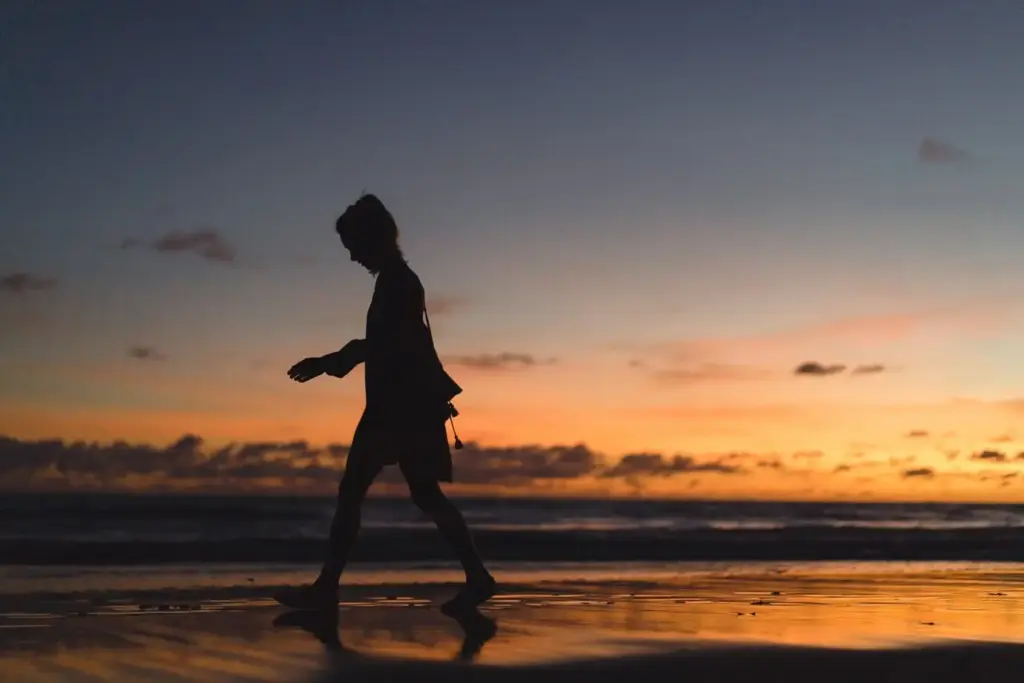
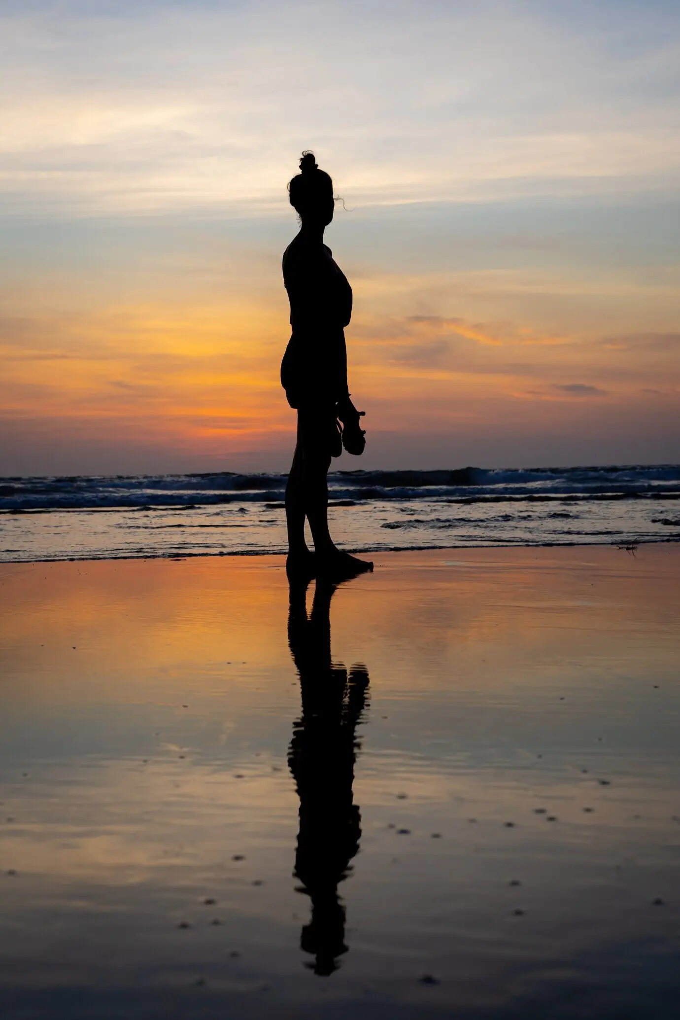
While waiting for afterglow, a fisher shared tide tricks and pointed to a sandbar that mirrors the sky after the last wave’s sigh. We followed his cue and found a flawless reflection just as mauve edged into deep blue. Simple gratitude, quick thanks, and an exchanged smile improved the photographs profoundly, reminding us that local knowledge often unlocks the shoreline’s most fleeting beauty.
A modest S-curve can add structure, but steep slopes quickly crush the steps between colors. Favor gradual transitions, watching histograms for bunching. Lift shadows slightly to reveal wet-sand texture without choking the midtones. When you toggle before and after, ask whether the edit still feels like the air you inhaled on the walk. If not, pull back until calmness reappears across the frame.
Split toning or color wheels can harmonize warm and cool bands, yet restraint keeps the result honest. Push gently, then stop short of candy tones that never appear at dusk over open water. Use targeted HSL to subtly lower saturation in aggressive channels, especially magentas and aquas. The best coastal edits feel breathed, not lacquered, and reward viewers who linger over soft boundaries instead of loud spectacle.
Subtle radial or linear gradients can nudge attention toward the most eloquent color steps. Feather masks generously, avoid hard edges, and slightly lower clarity where texture distracts from tonal flow. A delicate dodge can lift a reflective stripe just enough to echo the sky. Each micro-adjustment should support the larger mood, like a whisper that affirms what the scene already wanted to say.
All Rights Reserved.